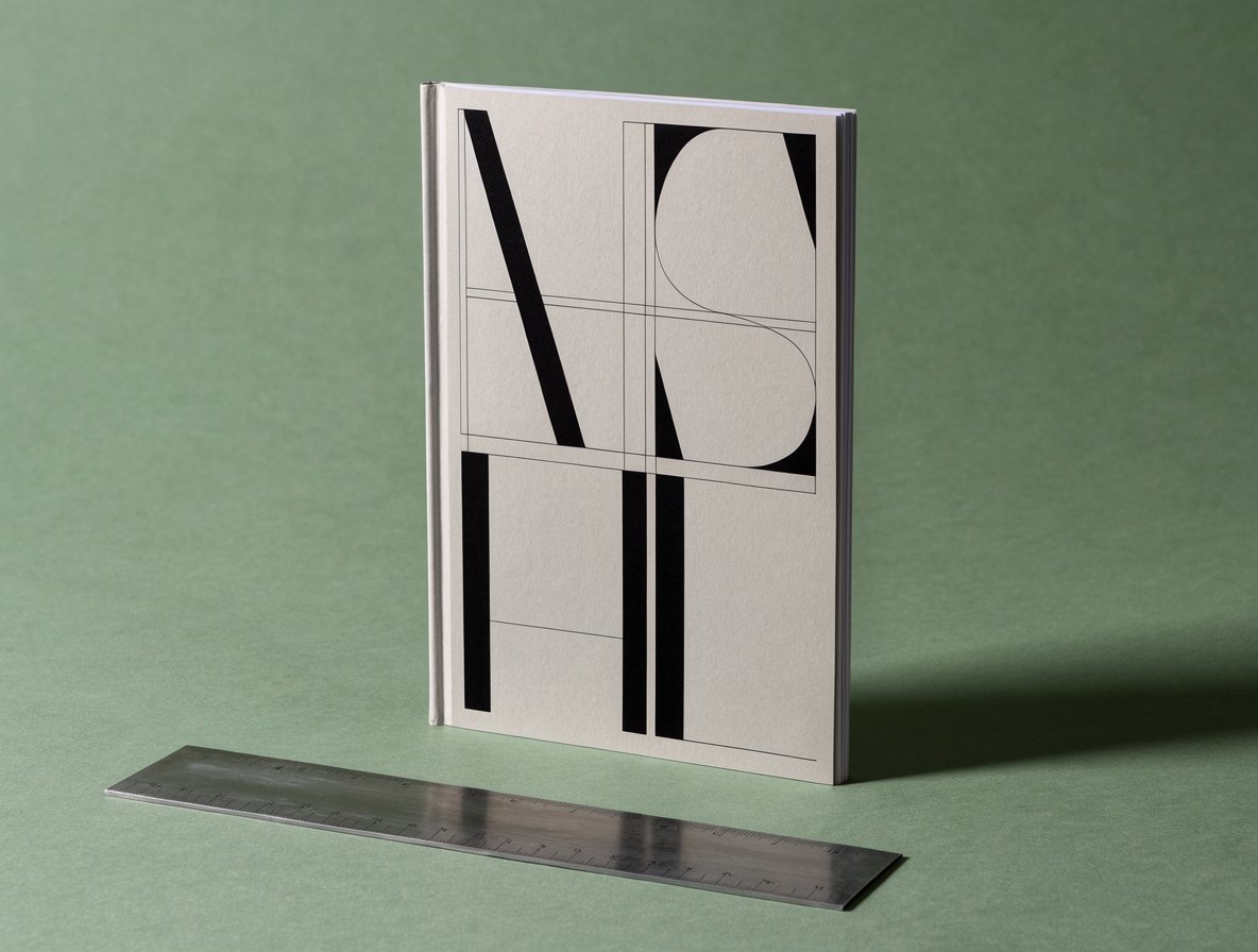
A logo is one moment. Typography is every moment after it. Starting with the type scale keeps identities honest.
Start where people spend their time
Visitors read your headlines, buttons and prices a hundred times before they look closely at your logo. So we start there. A clear scale of five or six sizes, two weights and one rule for spacing does more for a brand than any mark.
A scale is a set of decisions
Each size answers a question. What is the one thing on this page? What can be skimmed? What must never be missed? Once those answers are fixed, layouts almost design themselves.
The best identities we have shipped were type systems first and logos second.
Then the logo
When the scale is settled, the logo has a voice to match. It can borrow a letterform, a weight or a rhythm, and it never fights the rest of the page.